

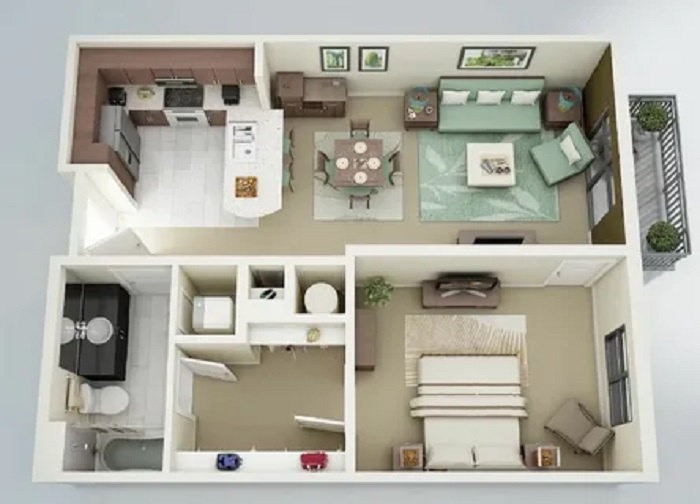
A good room photograph taken on a modern phone is somewhere between 4 and 12 MB, in a format half the recipients cannot open, at a shape that does not match any listing portal’s template. The photograph is fine. Everything around it is the problem, and it is the same problem every time, which means it can be solved once and repeated.
The three things that go wrong
The format. iPhones default to HEIC, which is efficient and poorly supported outside Apple’s ecosystem. Clients on Windows get a file that will not open; portals reject the upload; a contractor cannot view the reference shot you sent.
The size. A 12 MP image is around 4,000 pixels wide. Listing portals display at perhaps 1,600. Uploading the original means the portal recompresses it with settings you do not control, which is how sharp photographs end up looking muddy online.
The shape. Portals crop to their own aspect ratio, usually 4:3 or 3:2. If you have not cropped deliberately, the automatic crop will remove whatever it likes — frequently the ceiling detail or the piece of furniture the photograph was about.
A preparation routine
- Convert the format first. Run everything through a HEIC converter to JPG before doing anything else, so the rest of the workflow is dealing with one format.
- Crop deliberately to the target ratio, deciding yourself what leaves the frame.
- Resize to the destination. Using resize image to a defined long edge — 1,920 px covers essentially every web use — removes three quarters of the file size before any quality loss at all.
- Compress last. Only after resizing, because compressing then resizing wastes the compression and produces artefacts.
The order matters more than the tools. Resizing before compressing is the single biggest improvement most people can make to their image workflow.
Target sizes
| Use | Long edge | Target file size |
|---|---|---|
| Listing portal | 1,920 px | 300–500 KB |
| Email to a client | 1,600 px | Under 250 KB |
| Social post | 1,080 px | Under 200 KB |
| Printed brochure | Original | Do not compress |
| Archive master | Original | Keep untouched |
For the web sizes, running compress JPEG at a moderate quality setting will usually hit those targets with no visible difference on screen. Push the quality slider too far and the first thing to break is flat wall colour, which develops visible banding — a particularly unfortunate failure in interior photography.
Floor plans are a different job
Plans are line art, and line art compresses badly as JPEG — the format is built for photographs, and it puts soft halos around every hard line. Two rules: keep plans as PNG or PDF rather than JPEG, and never send a plan at a size where the dimension text is unreadable. A plan whose annotations cannot be read is decoration.
If a client needs to print it, send a PDF. If they need to view it on a phone, send a PNG at a generous width. Both, if in doubt.
Before-and-after sets
Match the pair. Same position, same focal length, same time of day, same crop. Any difference between the two photographs that is not the work itself undermines the comparison — a wide-angle “before” next to a standard “after” reads as a trick even when nothing was intended.
Keep the originals
Every step above is destructive. Keep one folder of untouched originals organised by property and date, and treat the prepared versions as disposable output that can be regenerated whenever a portal changes its requirements. Portals change their requirements regularly; originals do not.